
Finally. Apple has finally given us an analytics platform. Now we can easily leverage app performance data to make informed decisions. This can help your app succeed in the competitive app marketplace.
One important point before we continue any farther: iTunes App Analytics only collects data from users running iOS 8 or later and users who opt-in to sharing their data with app developers. This means the data you see is only a fraction of the total data – sadness. That being said, this opt-in data only applies to metrics like “Sessions” which track the user over time. Metrics such as “Sales” and “App Units” are tracked for everyone due to their importance to developers.
Simply go to https://itunesconnect.apple.com/WebObjects/iTunesConnect.woa to get started. Your account must have an admin, finance, or sales role in order to access App Analytics. When you log in you will notice five different tabs. We are going to focus on the “App Analytics” tab. Are you ready? Let’s do this!
iTunes analytics means you can finally know how your app is performing Click To Tweet
Starting Up
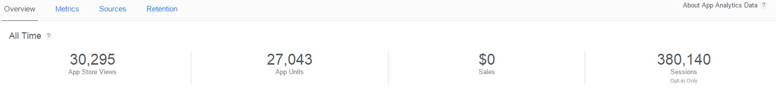
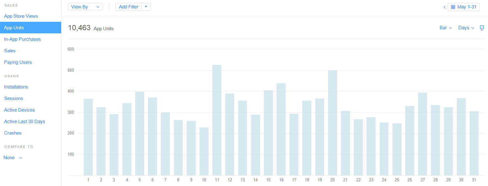
When you open up App Analytics, you will see your dashboard. At the top you will see the most important app metrics: “App Store Views,” “App Units,” “Sales,” and “Sessions.” This data is collected from the moment you launch your app. Below this you delve into the world of graphs. You will find many of the metrics above segmented into days put out in a bar graph. You can modify the range at the top right under the four numerical metrics.
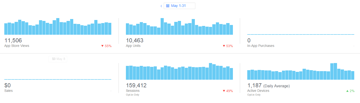
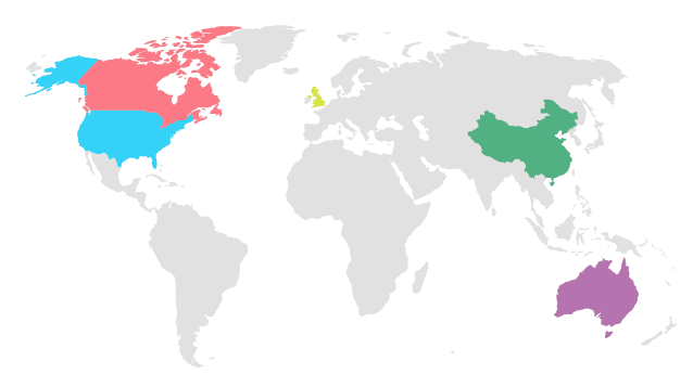
This allows you to see trends in your metrics as well as see if there are any spikes or dips. This can be extremely helpful for maintaining your app’s trajectory and assessing the successfulness of campaigns. Other features they added to this page include the ability to see how your app is performing by territory and by platform (iOS platforms only, i.e., iPhone, iPad, and iPod).
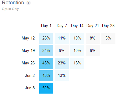
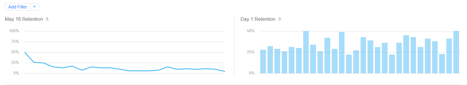
The last major feature on the opening page is a retention diagram. This opt-in diagram helps you see how many people are using your app after they download it. This lets you know how engaged users are with your app and if you need to encourage users to stick around. According to Forbes, average app retention rates vary a lot by app type, but on average 26% of users return to an app within 2 days and after a week it drops to 13%.
Graph Away
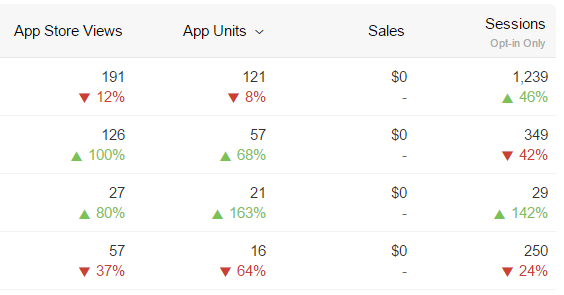
Moving on to the next section in App Analytics “Metrics,” you discover all the above data and more is available to be played with. You can take one of up to 10 metrics (pictured below) and put them into graphs (line, area, or bar) with the raw data listed below it. You can compare these metrics to each other using the “Compare To” tool you can also filter out certain data by categories such as platform, region, and referral website. You can also view the data in a striated graph showing different sources. All of this data can be downloaded and put into an excel document for further analysis.
Where is your traffic coming from?
The next section in App Analytics is “Sources.” This section lets you see the top referral websites for the top 4 metrics from the opening “Overview” page. The other major subsection in “Sources” is “Top Campaigns.” iTunes App Analytics lets you set up campaigns which allow you to easily filter data related to that campaign or advertisement. With this data, you can make inferences as to the success and strength of the campaign.
How is your retention?
The last section of App Analytics is “Retention.” This feature shows us app usage over time. In this section the data is shown 3 ways. The first graph shows user retention starting at a particular day going forward. This lets us see if drop off is steep or gradual over time. The next graph shows us the Day 1 retention rate for multiple days in a row. This graph can answer questions like: Is user engagement increasing or decreasing on certain days? Did a new campaign increase engagement? Did an app update increase engagement? The final diagram is a much larger version of the retention diagram seen earlier.
iTunes app analytics shows me exactly how people are (or aren't) using my app: Click To Tweet
What else can you do?
You can also look at “Sales and Trends” in iTunes App Analytics. This data allows you to answer questions like: Where are all of your units being sold (region, platform, and more)? If the app is not free, how much in sales or proceeds is it making? You can also look at “iAd” which allows you to advertise your app or monetize your app with advertisements internally.
iAd includes two main sections. The first one allows you to advertise for your app; you can make campaigns to help get your your app noticed. The second feature, in a lot of ways the more interesting one, helps you monetize your app. You can use it to add in advertisements into your iOS app and earn money off them. The advertisements come in many different forms from pop-ups to banners and integrate seamlessly into your app. Apple helps you with implementing the additional code. You can also block advertisements for competitors. This is a great feature if you need to generate revenue from your application without too much intrusion on the user’s experience.
Conclusion
iTunes App Analytics is a useful program for understanding more about your app related data. It is a surprisingly complex tool, with many interesting features. Now that you know the basics, go out and explore your data. You got this! If you have any questions please email us at [email protected]