Before launching into a fun afternoon of data visualization for your organization, it is important to ask the fundamental question – why? Why are we creating this graphic and what is the intended outcome for the work? I love a good map as much as the next person but if the data behind the map is poorly collected and the story the map tells is poorly conceived, I am afraid all you may have done is to create a bit of data porn.
In order to guard against this kind of #datafail, here are some tips, ideas, and tools to create a useful map visualization map for your nonprofit.
1. Start with ‘why’
Define the narrative you hope to build around the visualization and the message that you want to resonate with the people that look at it. Which emotions do you want to evoke and what would a next step be for someone that want’s to take action? I love Simon Sinek’s approach to thinking about this.
2. Collect, mix and match the data
Find the data you need to tell your story. Often the most valuable insights come from combining different data sets. Some sources you may or may not have considered:
- Data.gov – this site houses tons of data sets across areas such as transportation, health that can easily be exported to CSV.
- Google Analytics – your web traffic can be exported in aggregate and you can pull this by location as a CSV or a KML map file.
- Google Trends – trends gives comparative data for a particular search and lets you pull these rankings (manually) by state.
- GovTrack.us and VoteSmart.org– shows representatives and voting records on all issues/bills.
- Programmatic data – this data would come from your internal databases and, if anonymized, can be used to tell your story.
- Crisis Text Line Trends – open and anonymized data around where CTL receives crisis texts by type and location.
3. Clean and Analyze the data
- Pull the data to excel (or database of your choosing) and make sure it is consistently organized and uniform in the units being used.
- Make sure there is a ZIP code or address in one of the columns. Using just a ZIP code or City is enough to randomly create a lat/long that won’t reveal too much data.
- You can include links to content, photos, or other interesting details if you want to create a story map that shows where different events happened. This is how Charity Water tells their story of impact very effectively.
- Geocode the data
In order to put something on a dynamic map you need a latitude and longitude coordinate for each row of data you want plotted. If you are just looking to do a static info graphic by state you can skip this step. - Use Google Fusion tables to automatically look this up. Upload your clean CSV and Google Fusion tables can automagically generate these lat/long coordinates for you, and even map them or let you then export them.
- For smaller datasets you can use a simpler tool like GPS Visualizer to generate the lat/long coordinates.
- Use Visualization Tools
- Google Fusion Tables – I have used Google Fusion tables and their charting to create heatmaps – example: https://developers.google.com/maps/documentation/javascript/examples/layer-fusiontables-heatmap.
- Carto DB – free if you use it publicly, great mapping software. Examples: https://cartodb.com/gallery/bbva-mwc/
- Tableau – free option but costs $ to have the full functionality.This is probably the most widely used data viz software and has a lot of bells that can do a lot more if you buy into it. Example http://www.tableau.com/solutions/mapping-software
- D3js.org – free but takes decent dev to manipulate, this is how the NY Times does cool stuff. Example of dynamic map https://vida.io/documents/s5qo5Gwrct5HNxAD2
- Infogr.am – free if you are ok having their logo at the bottom. Simple embedded map, as well as other graphs that are dynamic.
- Canva.com – free web based design software that lets you create simple info graphics for non-designers.
- Chartsbin.com – free web based tool to create simple, interactive global maps that are good for heat map style data.
- Build the data – story – action loop
Moving people from the informed to influenced to take action step takes a final ingredient. This method of using data to inform the brain (logic center) and story of the individual to influence the heart (emotional center) is a recipe to motivate people that is brilliantly outlined by Dan and Chip Heath in their book “Switch” (youtube summary here). The final ingredient is to try to find that one story that teases out a data point and then give people an immediate way to take action (pledge, petition, donation, etc). Make it a simple first step and make a clear ask. The tools we recommend all allow you to embed this map on your website so you can be more deliberate about crafting this narrative.

Online Course
Google Data Studio Tutorial + Templates
Take your reporting from 0 to 100 with this crash course in Google Data Studio, a 100% free yet robust reporting platform!
An idea I hope someone does…
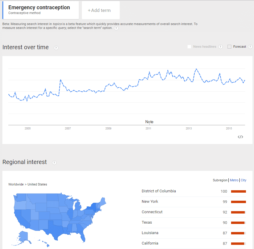
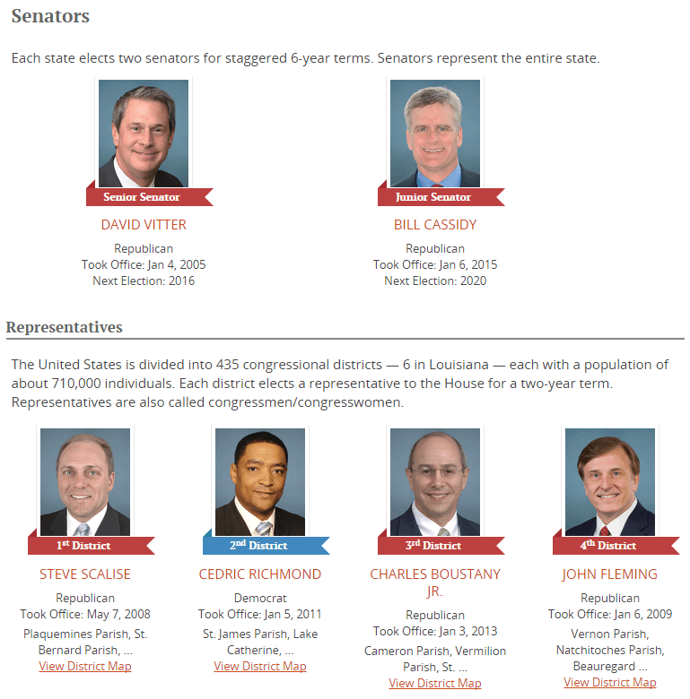
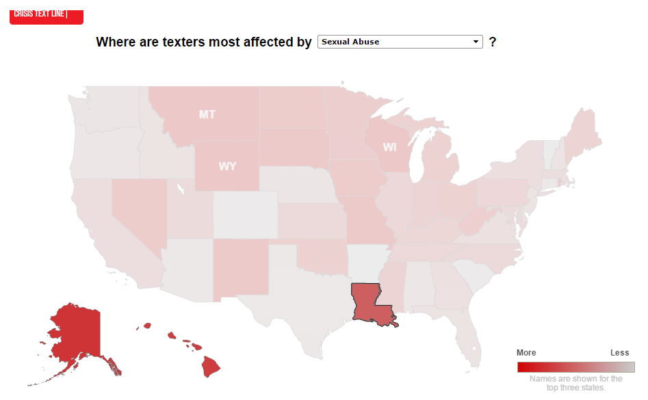
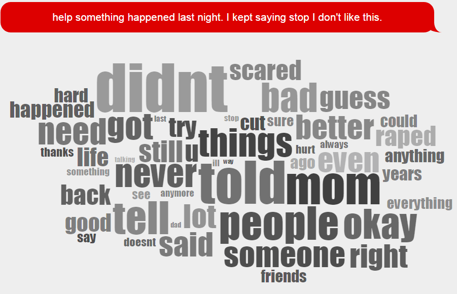
Using the data and approach above you could create a map that overlays people’s demonstrated interest vs their voting preference by combining how elected officials vote/represent vs what people search for in a region. For example we looked up search volume for “emergency contraception” by state and found that Louisiana over-indexed based on search vs population. Then we looked up the representatives and their voting records for emergency contraception and found that as a whole they consistently voted against the issue. Finally, to bring in the story we used CTL’s crisis data to show crisis texts for sexual abuse for Louisiana and then a single text message that a teen sent as well as a word cloud. The action would be up to the organization…