
 Here’s a classic stats joke: Three statisticians go hunting. One fires and misses his targeted deer 3 feet to the left. The second also aims and misses, her shot falling three feet to the right of the deer. The third one jumps in celebration and exclaims, “We got him!”
If that joke didn’t cause you to explode with laughter, much to the bewildered looks of your colleagues, then you’re probably not a data geek. Luckily for you, I am. In this article, I will explain why statisticians should never go hunting, and also how the ubiquitous statistic known as the average can sometimes lead to faulty conclusions.
Why is my average wrong?
Every stats guru knows the deal: “If Bill Gates walks into a room, everyone, on average, is a millionaire.” Certainly, the average is a useful tool for summarizing a range of numbers into one convenient statistic. However, the average can get skewed at times when you have data that fall outside the typical range of values – outliers, if you will. In such cases, the representativeness of your average diminishes, and its value as a summary statistic is undermined. And then you get some very unhappy results.
The example below illustrates how using averages can sometimes get your hopes up. Your boss comes in with a data table containing a bunch of stats for your website and tells you to translate it for him. “Ew, numbers!” you say and quickly transform the data into a neat visual that you can use for analysis. You want to study the traffic to your site, and so create the following graph…
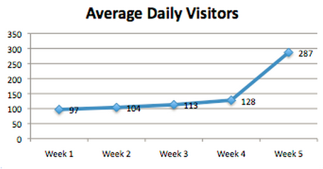
What you think:
Yes, our site has really taken off this week! We doubled our number of daily visitors. Next week we’ll have 500 visitors per day!
But, actually:
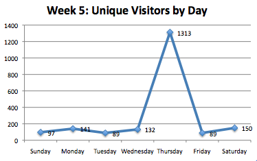
A closer inspection of week 5 reveals that the jump in average visitors was the result of an outlier. On Thursday, unique visitors exceeded 1,300 thanks to the short-lived success of the article “5 Ways Kim and Kanye’s Baby is the Sign of the Apocalypse”. Unfortunately, traffic fell back down to its regular numbers on Friday and Saturday (and you also probably lost major journalistic credibility as well). In fact, the average value of 287 was much higher than the actual number of visitors on 6 of the 7 days! Because our sample of 7 days was very small, the outlier was super effective in skewing the average.
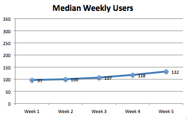
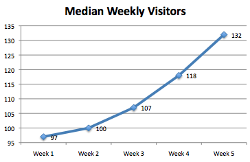
So what do we do now? Find the Median!
During trying times like these, the ever-faithful median comes in handy. In case you forgot since stats 101, the median tells you the value that falls right smack in the middle of the distribution. So, for 7 days worth of data, the median would be the 4th highest (and also 4th lowest) number. It is immune from the wrath of an outlier, because it simply does not factor in these values. In the above example, the median is 132. Thankfully, this value is much closer to what we would project for our site’s daily traffic. As you’ll notice in the graph below, weekly medians paint a more modest picture about your site’s growth. But also, a more realistic one.
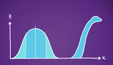
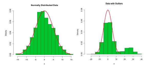
Obviously, I’m not calling for the abandonment of the average as a summary statistic. I’m simply bringing to light instances in which its use can be misguided due to unmet assumptions. The main assumption that needs to be satisfied is that the data follow a normal distribution. In short, a normal distribution is shaped like a bell curve. Yes, I’m asking you to think back to your 4th grade standardized tests. I apologize. If the distribution of the data doesn’t resemble this shape, or if has numerous outliers, you may want to consider using an alternative summary statistic. However, when the data is normally distributed, the average is a powerful tool, especially when used in conjunction with the standard deviation (stay tuned for an article on that…)
Extra Credit: Can you spot the difference?
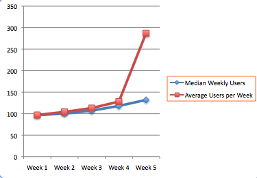
I used the same exact data from the above chart on median visitors to produce the chart below. Yet, the one below shows that growth has been increasing at a lightning fast pace. Why did the same data lead to such different graphs?
The answer is scale! Note the values on the x-axis of the charts. One ranges from 0 to 350, and the other ranges from 95 to 135. In reality, your company has around 35 more daily visitors on week 5 than on week 1. Is this a lot? That difference can seem negligible or monumental depending on the scale you specify. It is important to note that if you’re looking to compare groups of data, your scales better be kept consistent. Check out the graph below which compares site traffic using median and averages. As can be seen, the two summary statistics say the same story for the first 4 weeks, but their accounts diverge on week 5.
The Bounce Rate Mistake
Bounce rates present a classic “average” mistake. Though its one of the first metrics that Google Analytics dashboards give users, it requires careful interpretation. A page’s bounce rate tells you the percent of users that came to your page and then left, without visiting other pages on your site. So, a high bounce rate is always a bad sign, right? Nope. For some types of pages, a high bounce rate is expected. For example, what if the point of a particular page is to have people leave it – ie in the case of a donate page hosted on another third party site or going to a social media profile? You could have tremendous success driving people to these goals, but as a total site bounce rate the site will look like it is turning away users. What do you do? Remember that context is king! Pay attention to bounce rate to top landing pages whose purpose is to keep people on the site.
See example of tracking multiple bounce rates for key pages, allows to see the important bounce rate trends missed by the average bounce rate in blue. In this case, it may be time to examine what the goal of the /action (in green) page is given the higher bounce.
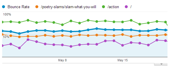
(source PowerPoetry.org)
Be below average!
Don’t fall victim to outliers. They can inflate your average, and inspire false confidence. Having a repertoire of statistics on hand can help you investigate findings more accurately, and avoid pitfalls caused by outliers and other nuisances. Create visuals of your data, this increases the accessibility of the data in comparison to scanning a mind-numbing Excel spreadsheet.
And oh yeah, never go hunting with statisticians.